IAM Union Adopts Updated Branding in Nod to Proud Past, Bright Future Ahead
WASHINGTON, May 5, 2025 – IAM Union, formally known as the International Association of Machinists and Aerospace Workers, is responding to member feedback by updating its branding in an effort to further meet the needs of a diverse membership.
The rebrand comes after IAM’s Committee on the Future (COTF) held 45 listening sessions in 29 cities across North America, as well as 12 additional online listening sessions, allowing thousands of members to express their views on the future of the union. Among other findings, the COTF recommended that IAM update its name, terminology and brand to reflect the diversity of its membership.
Additionally, in September 2024, delegates to IAM’s 41st International Convention passed a resolution to rebrand the union in a way that honors its 136-year past while becoming more relatable for current and future members from a growing array of backgrounds.
The 600,000-member IAM Union is amongst the most diverse unions in North America. Founded as a railroad union in 1888, the union has continuously grown and adapted to represent workers in the airline, aerospace, defense, manufacturing, automotive and transportation sectors. Today, thanks to large-scale organizing efforts, IAM also represents workers in the healthcare, non-profit, wood, pulp and paper, government, emerging technologies, and other industries.
“IAM Union has always adapted with the times. Our past is a story of continuous change that has led us to become one of the most powerful forces for working people in history,” said IAM International President Brian Bryant. “Now, after hearing from our membership, we are proud to begin our next great chapter under a unified and inclusive umbrella – IAM Union.”
IAM Union’s primary branding changes include:
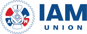
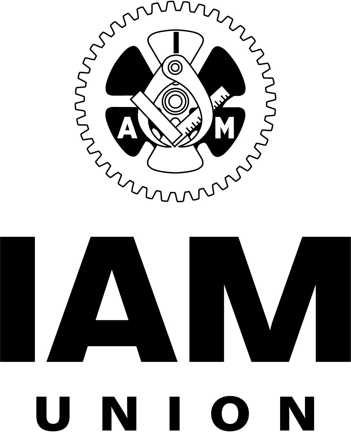
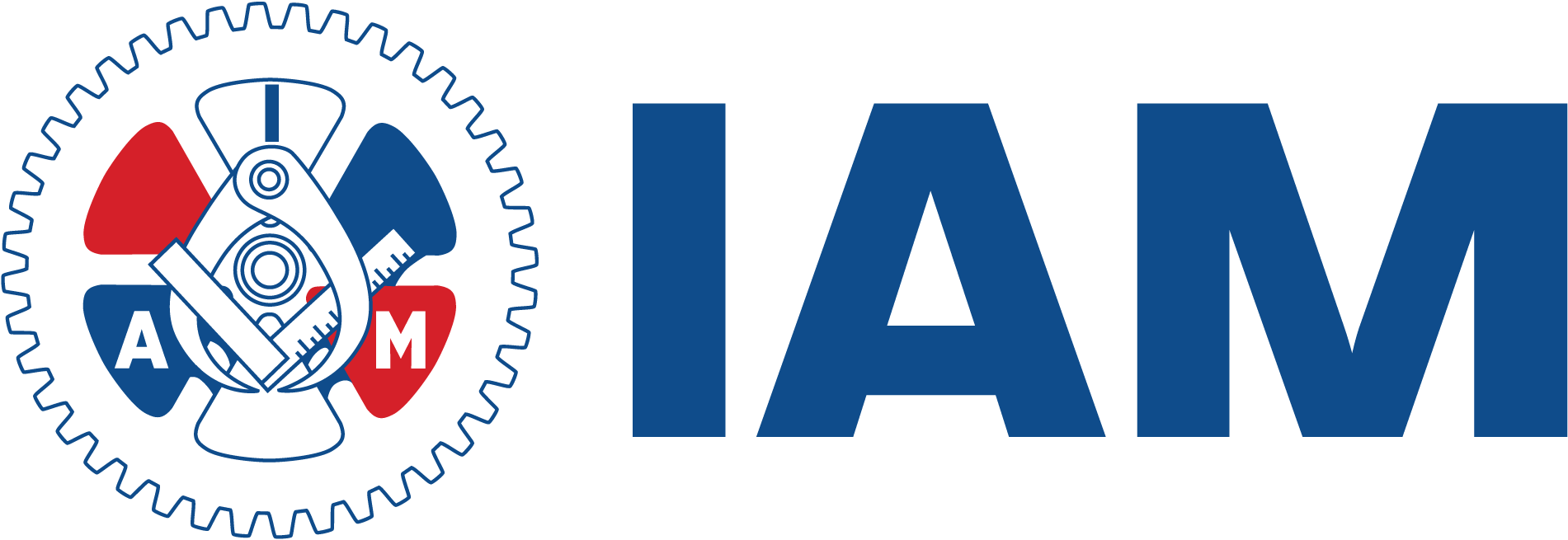
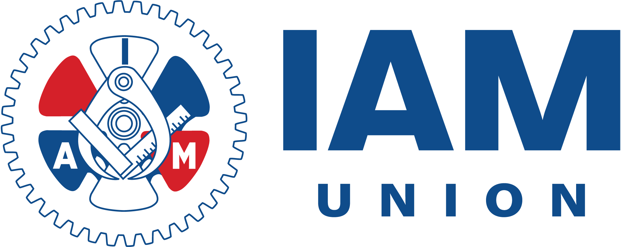
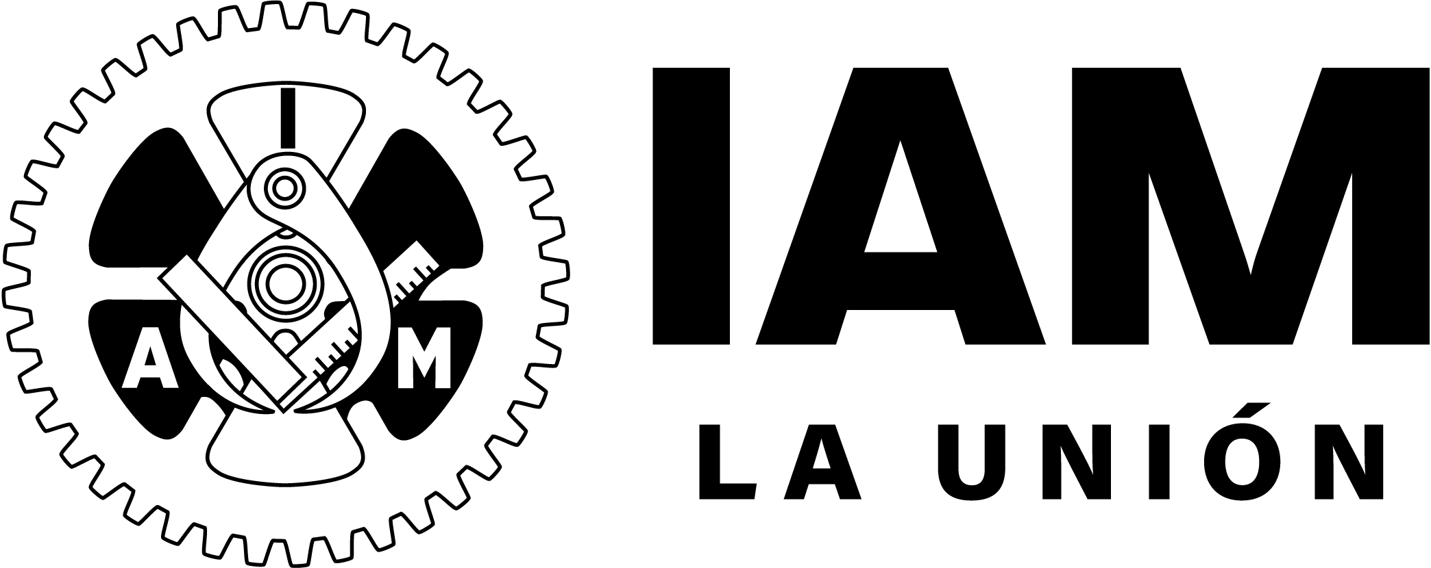
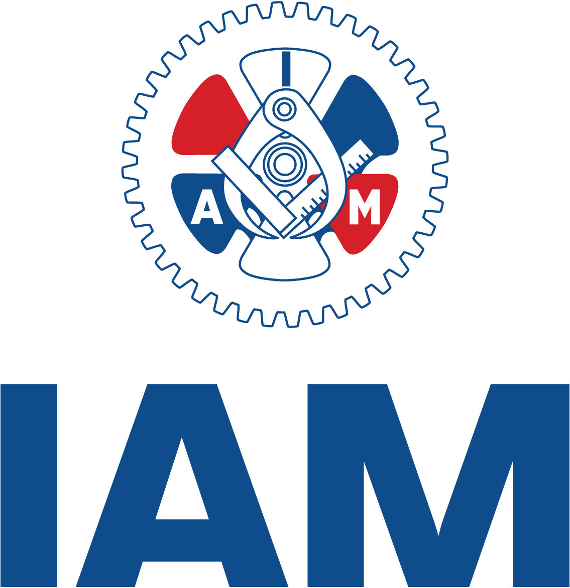
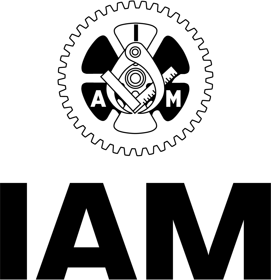
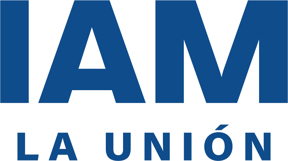
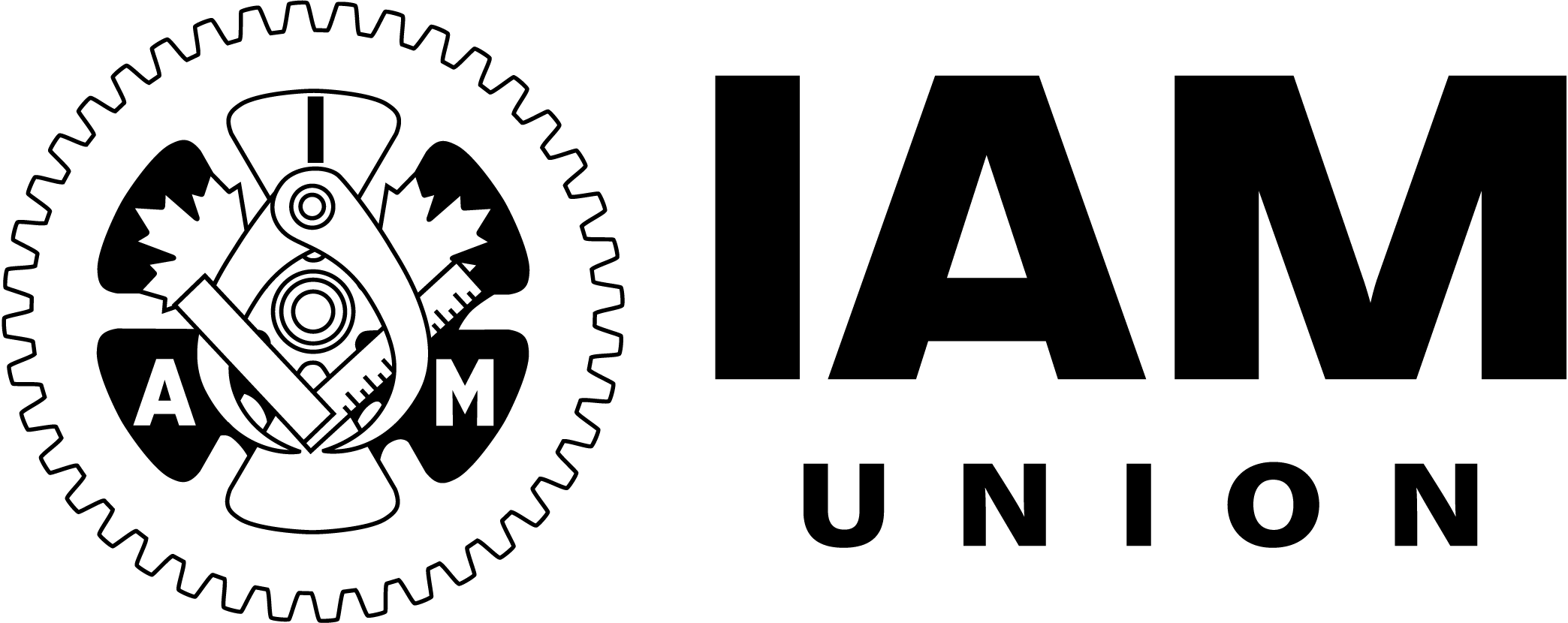
- While retaining its formal name, the International Association of Machinists and Aerospace Workers, the union will primarily now go by “IAM Union,” or simply, “IAM.” IAM has been a common abbreviation used by members and the public for generations. This is seen now in sectors within IAM, such as IAM Healthcare and IAM Automotive, and will continue to expand.
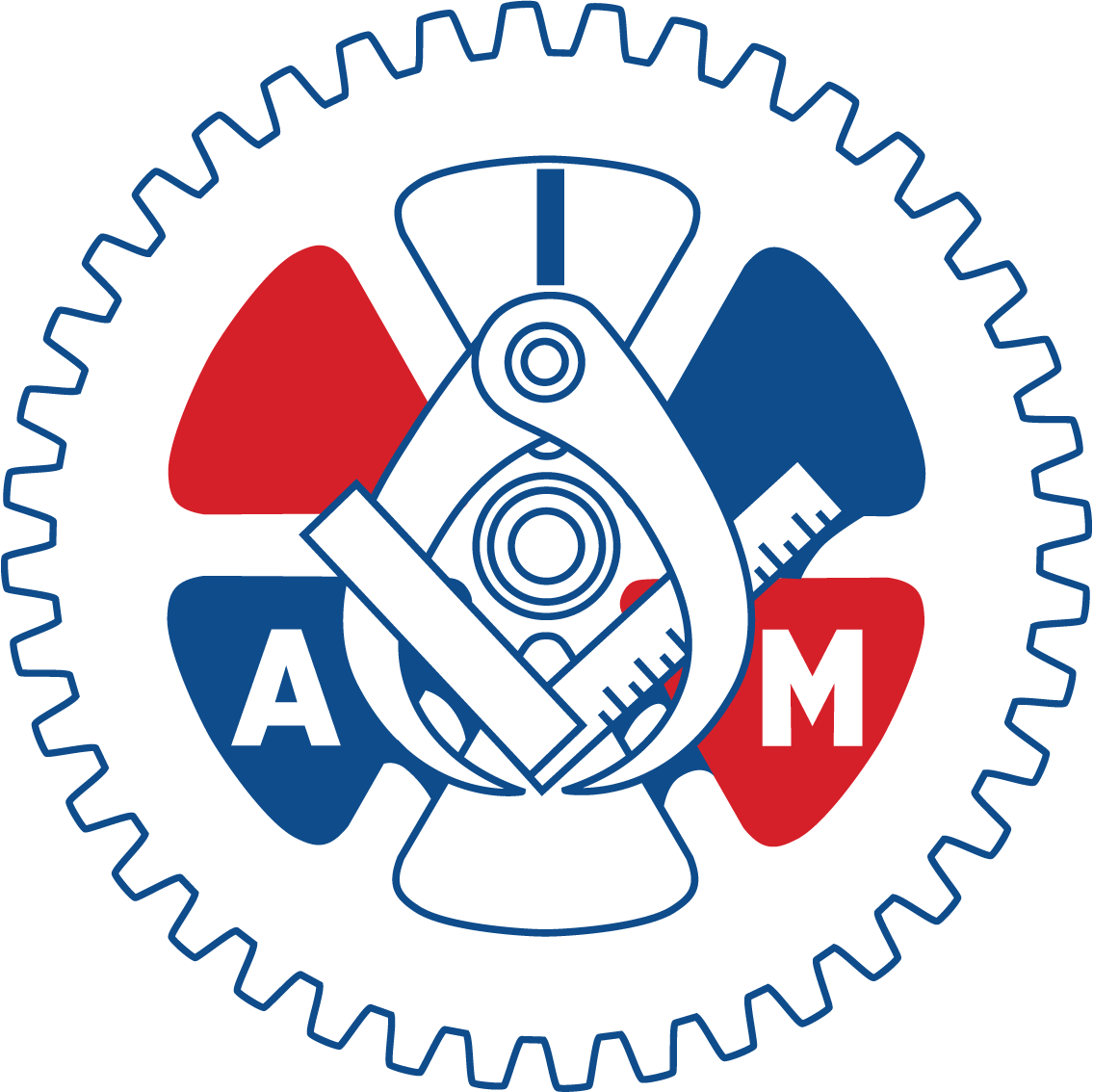
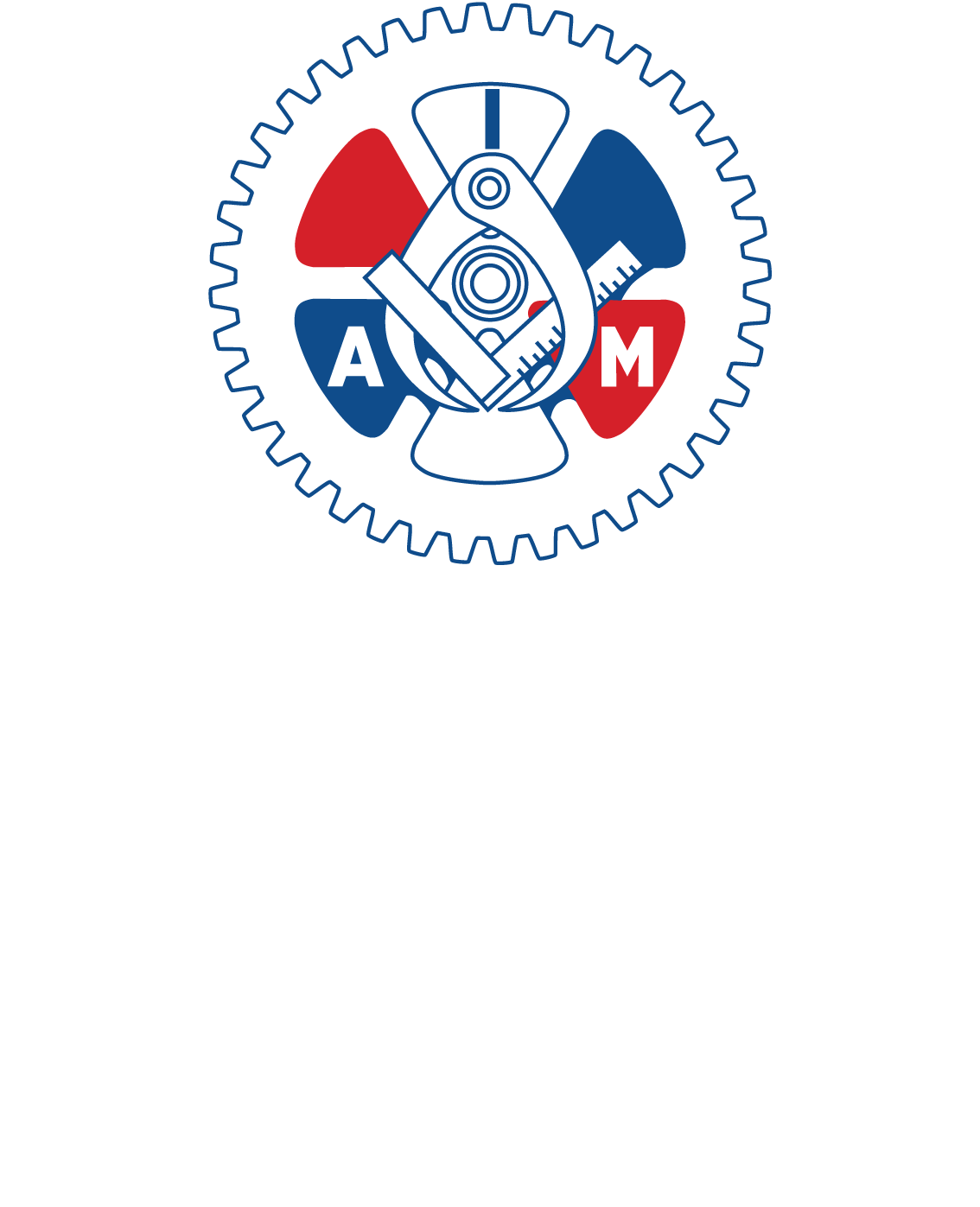
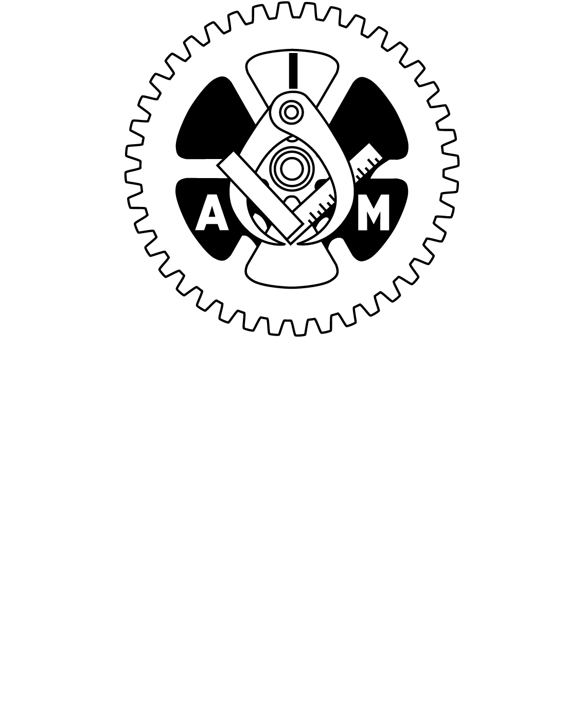
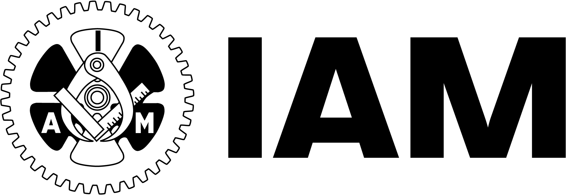
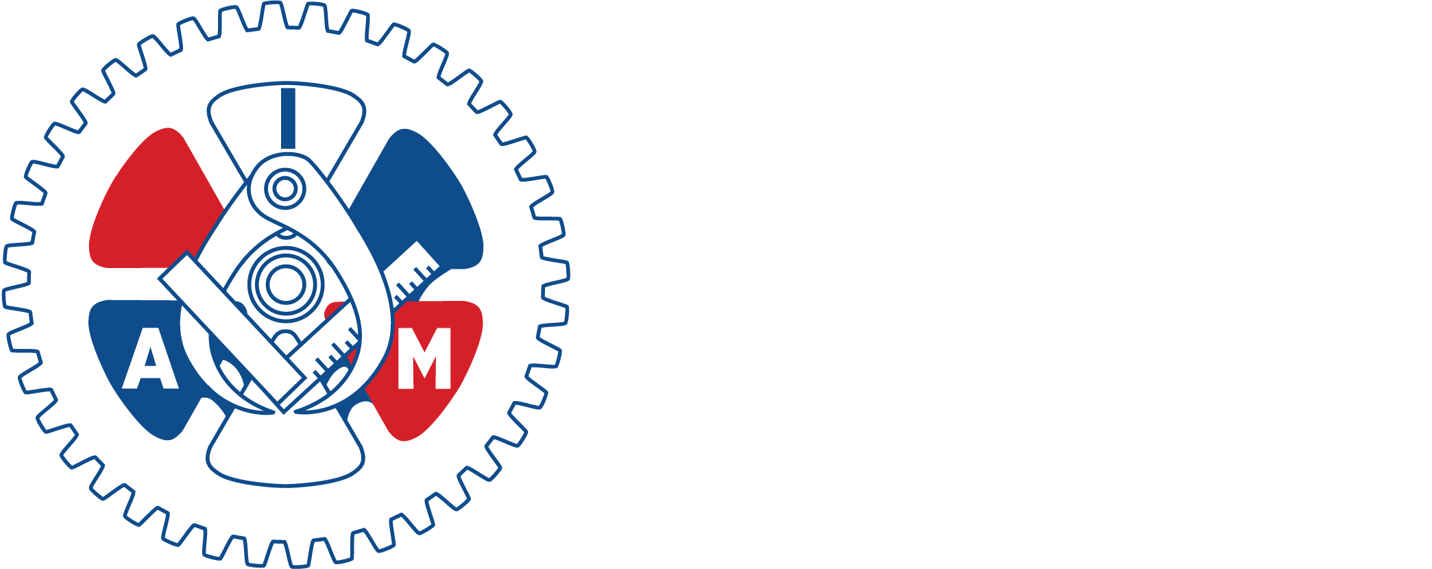
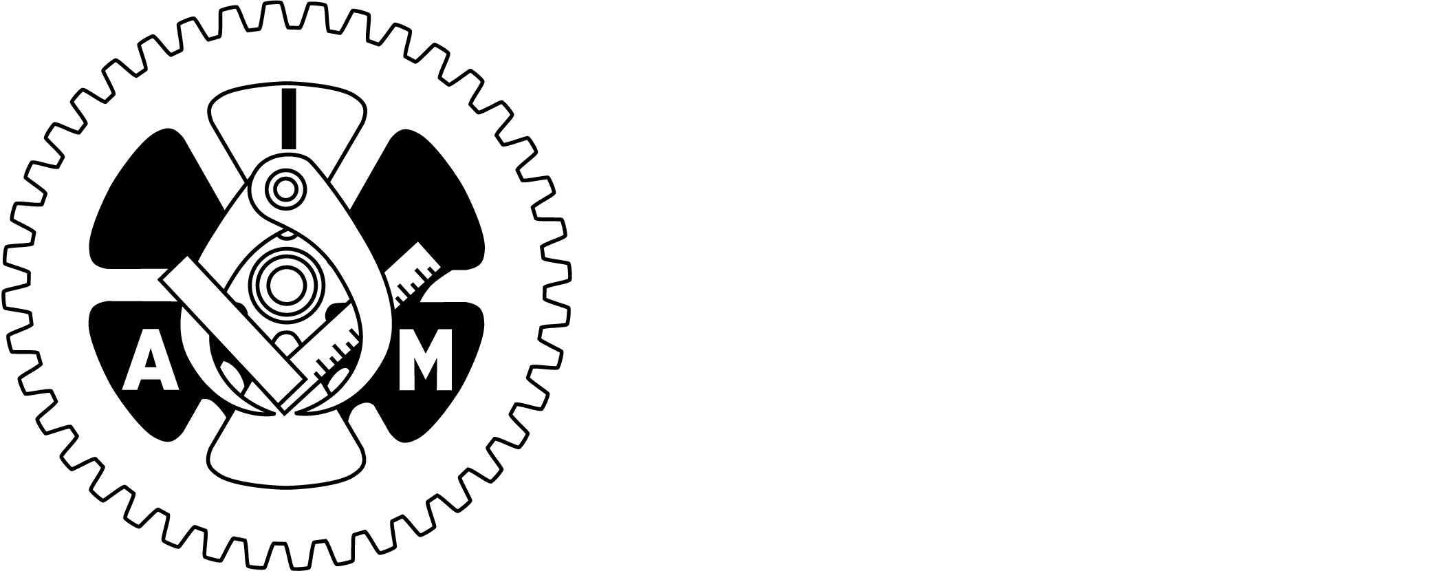
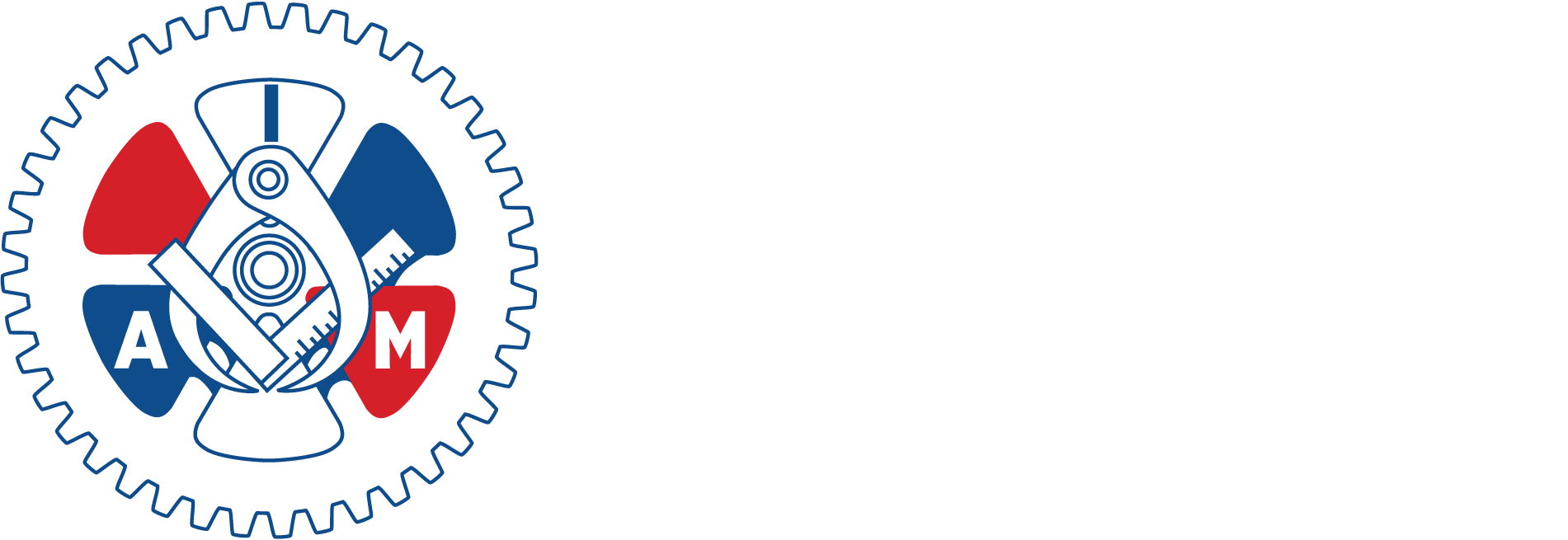
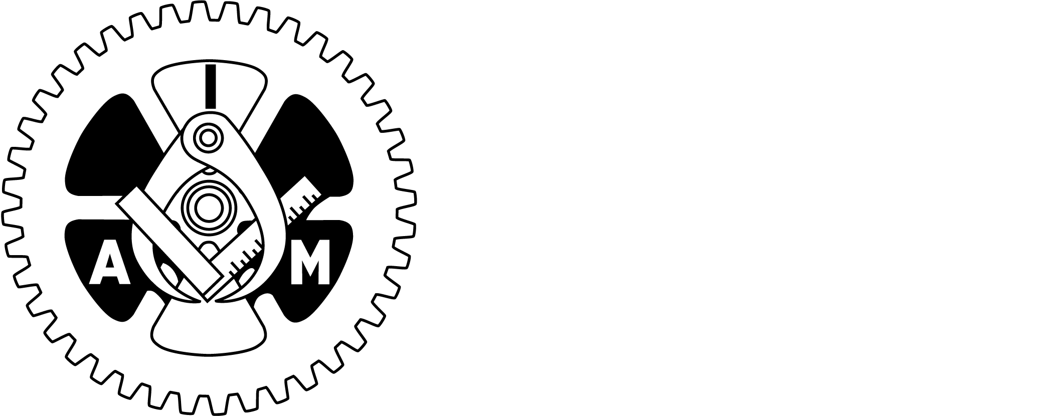
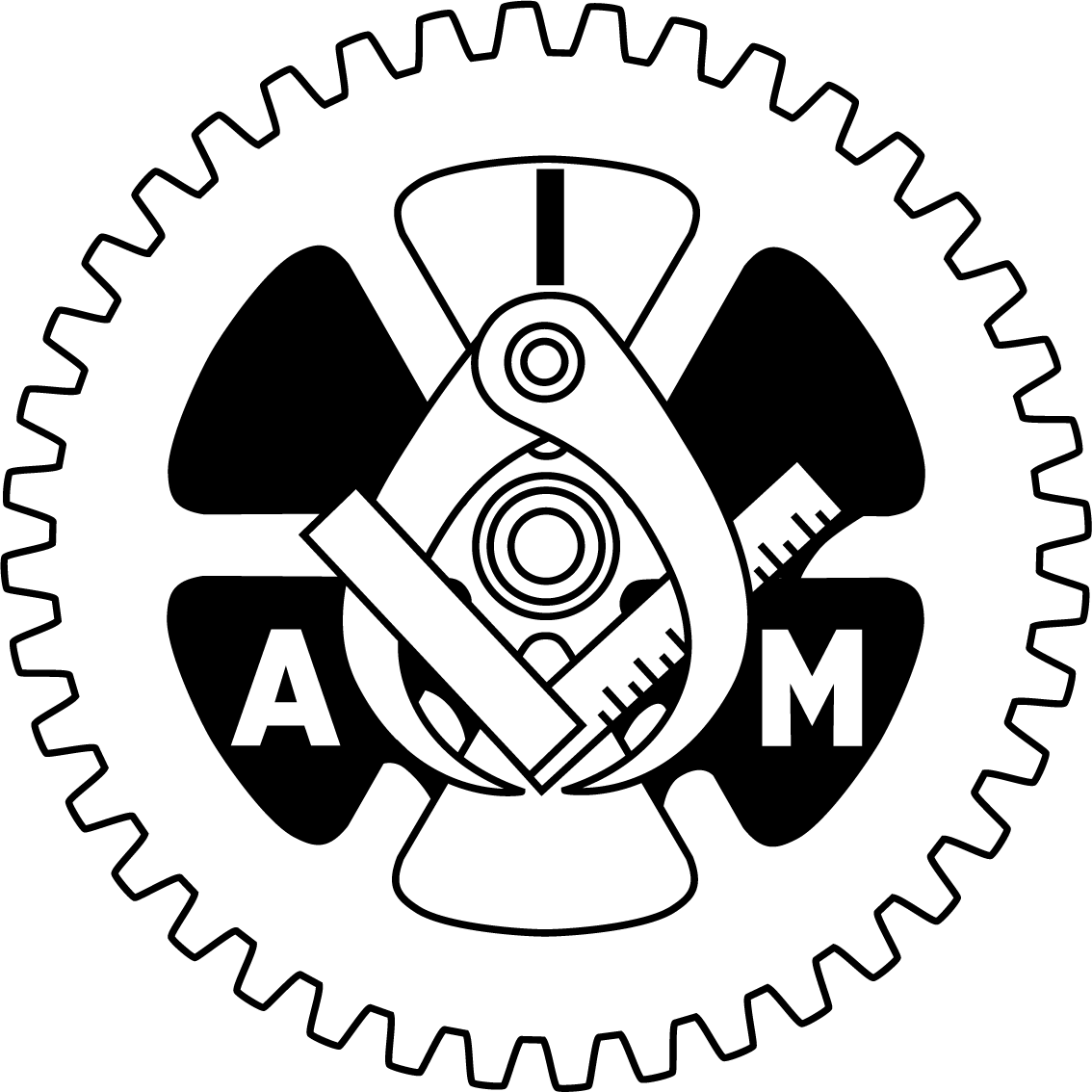
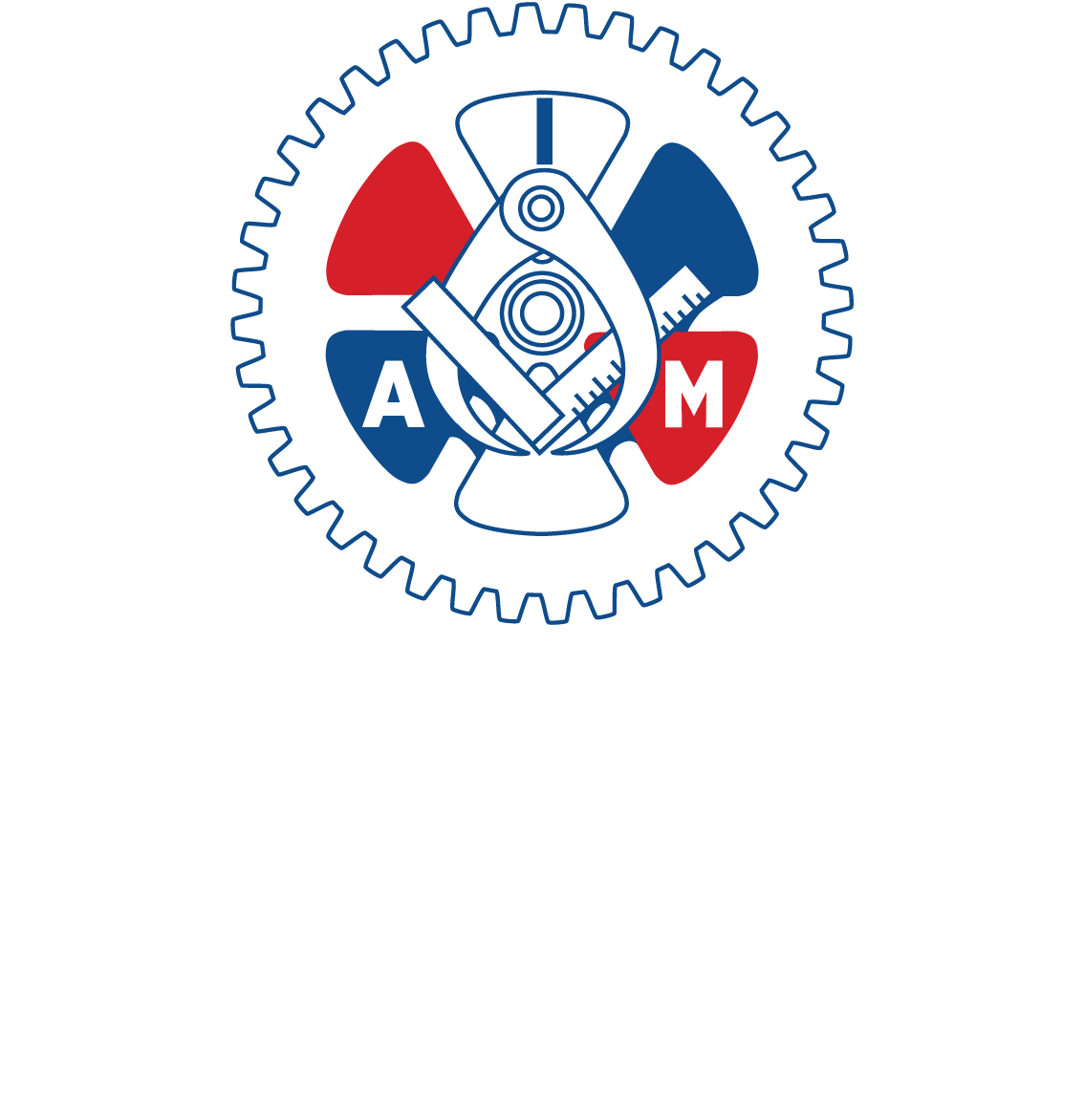
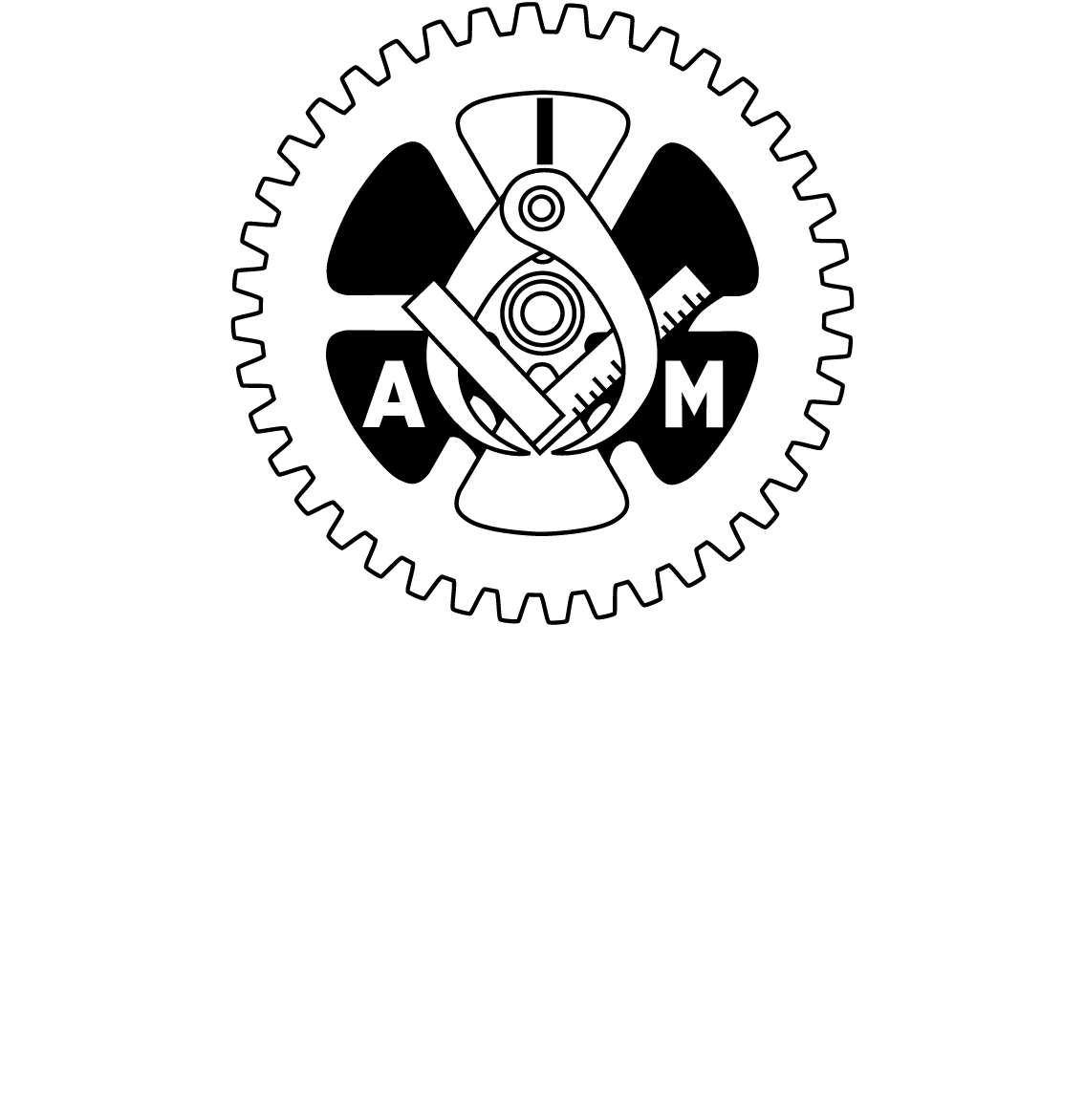
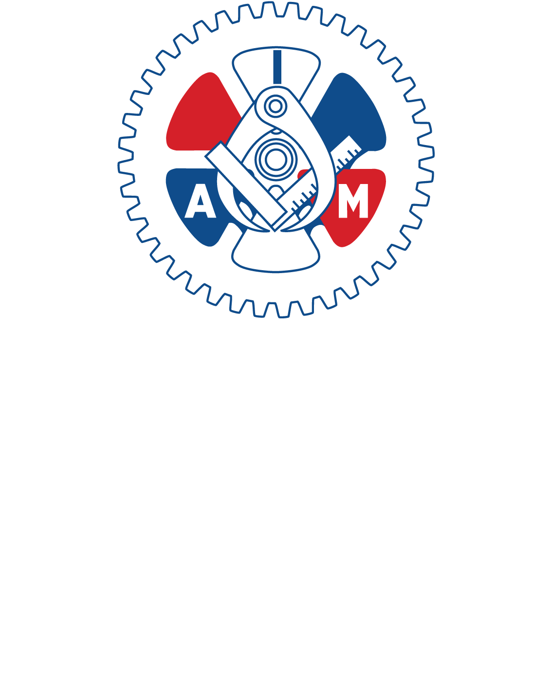
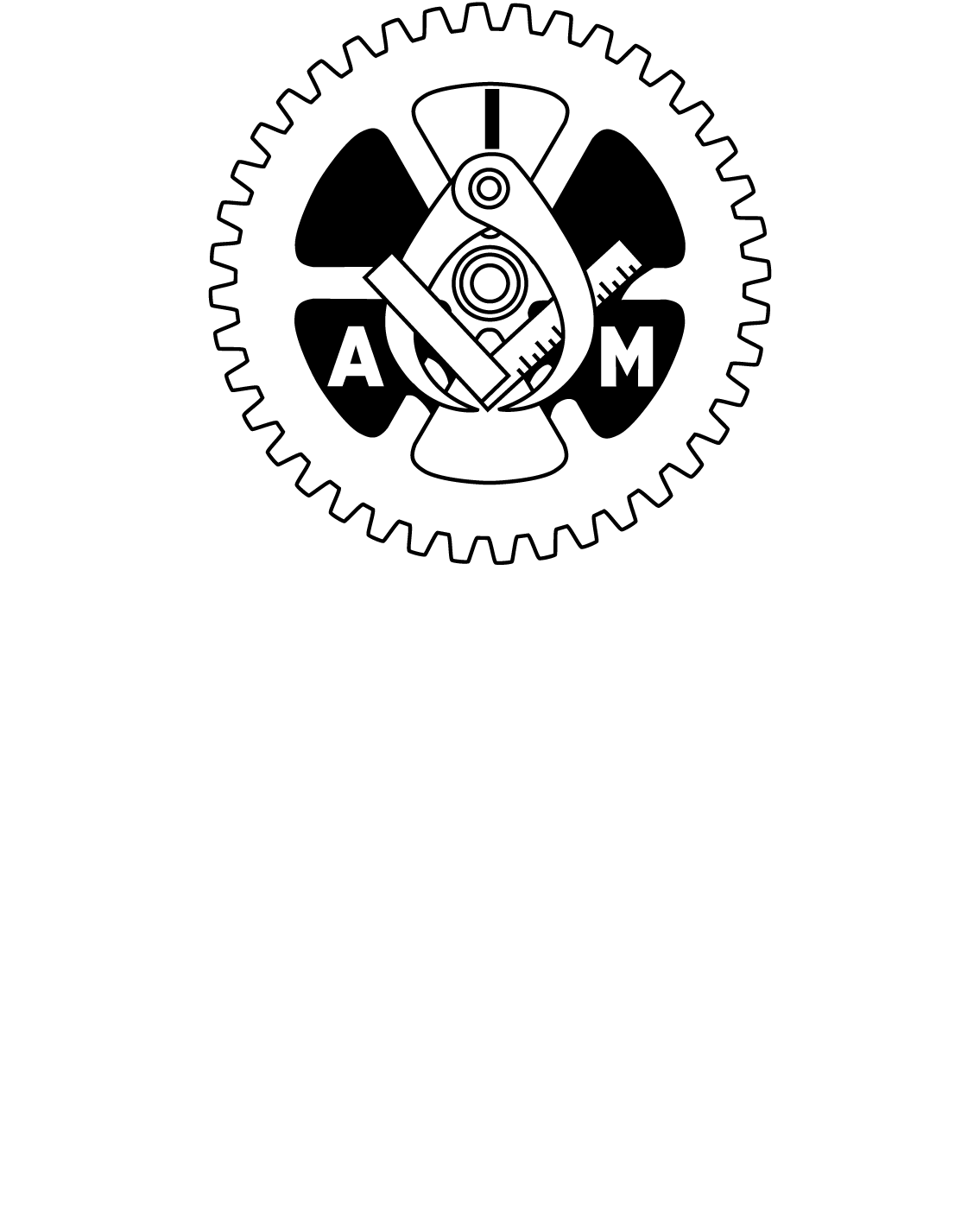
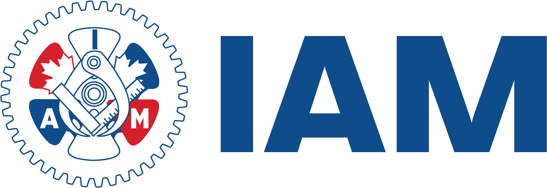
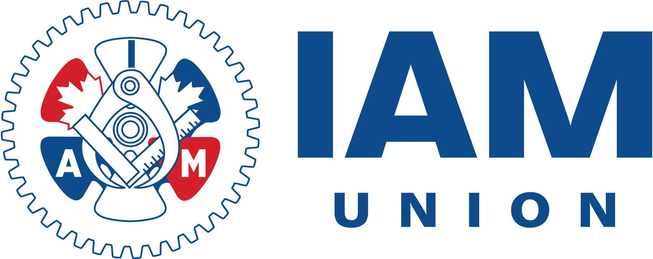
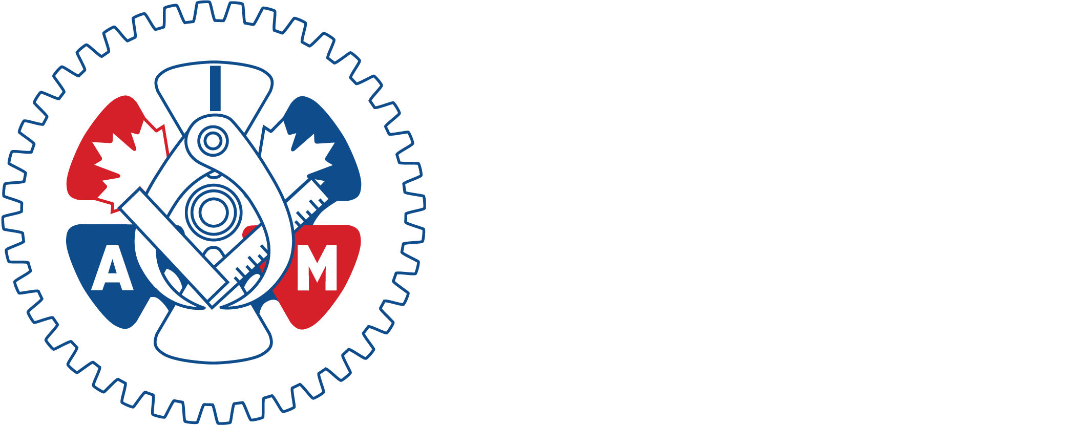
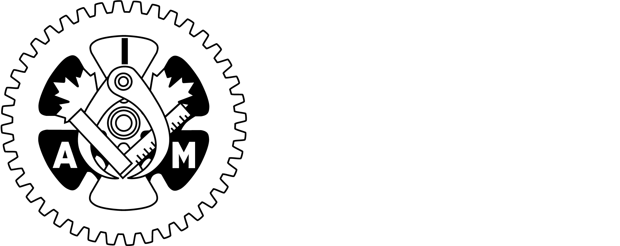
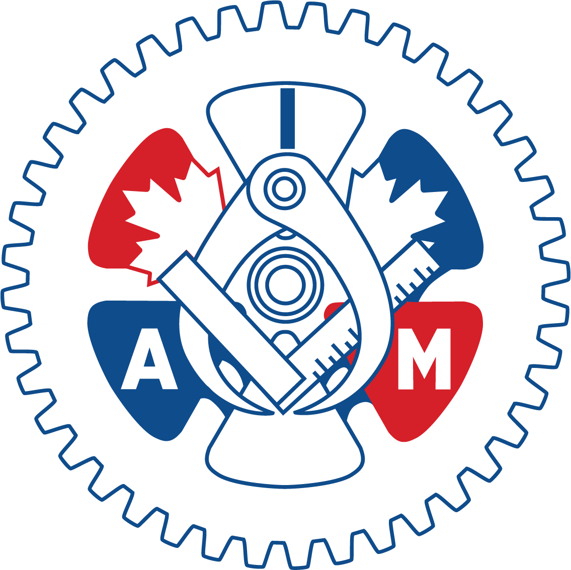
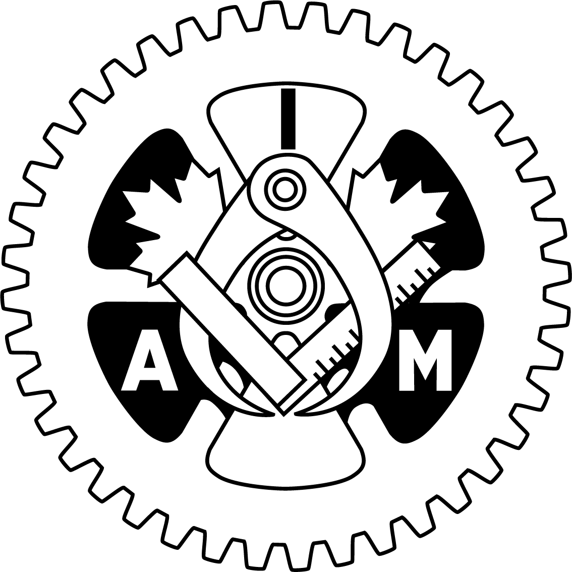
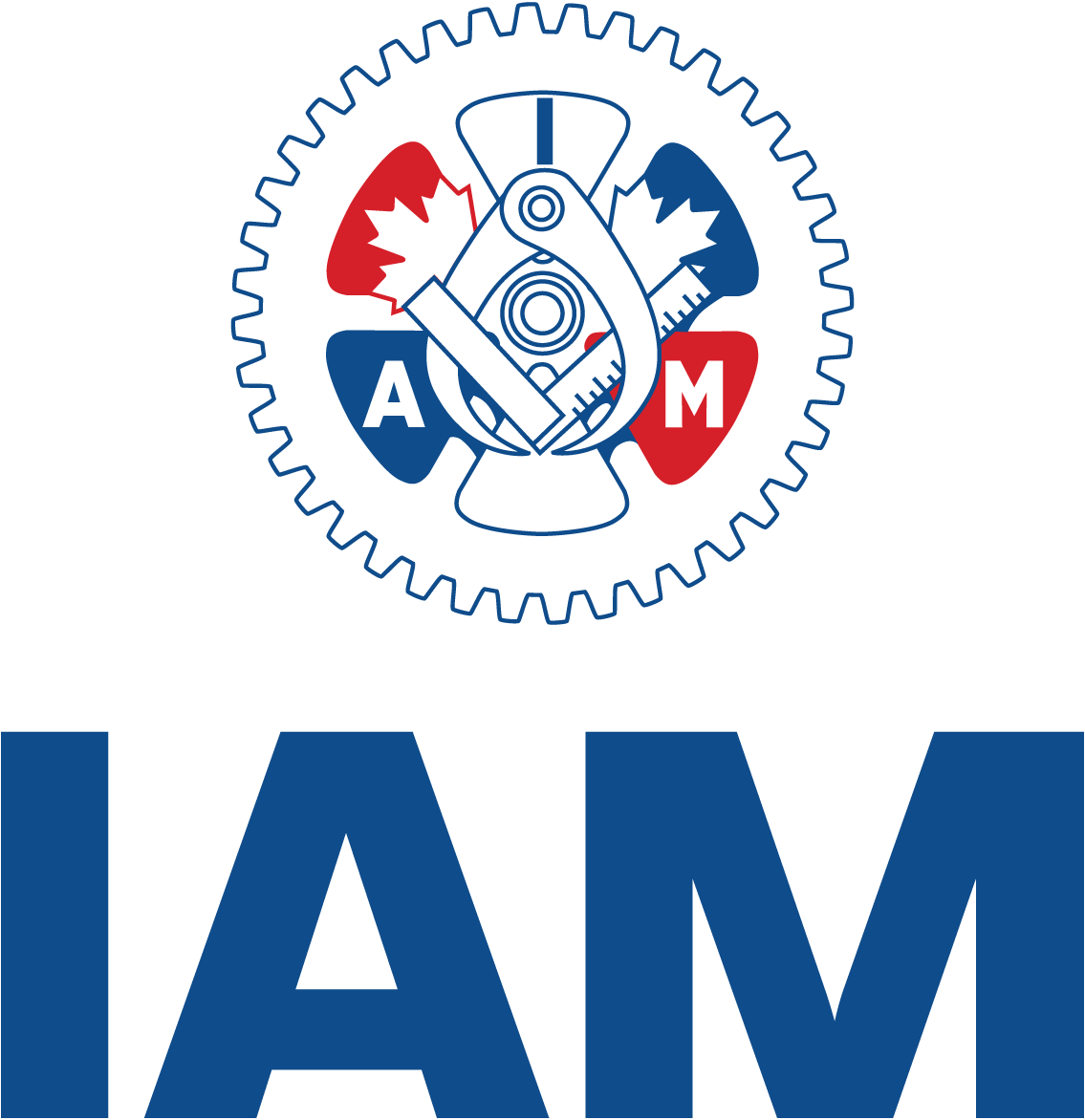
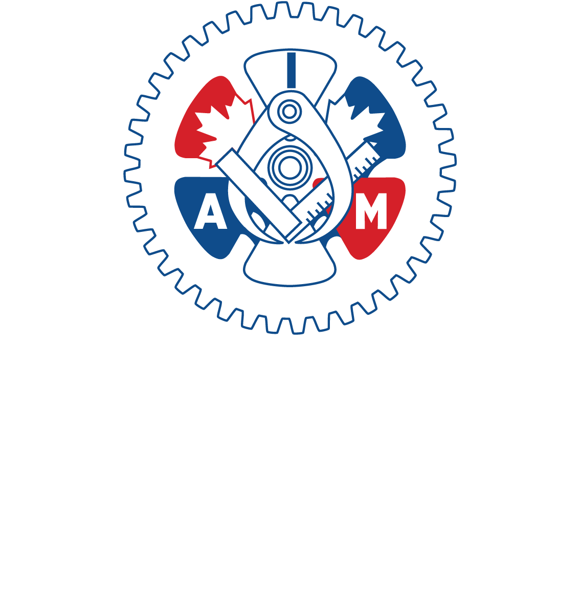
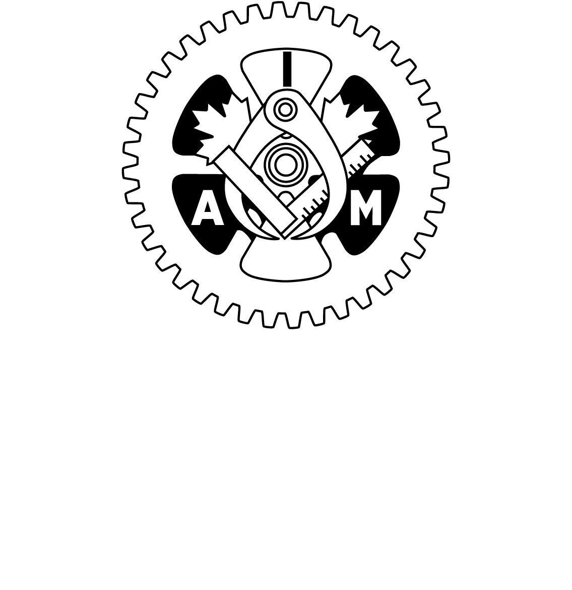
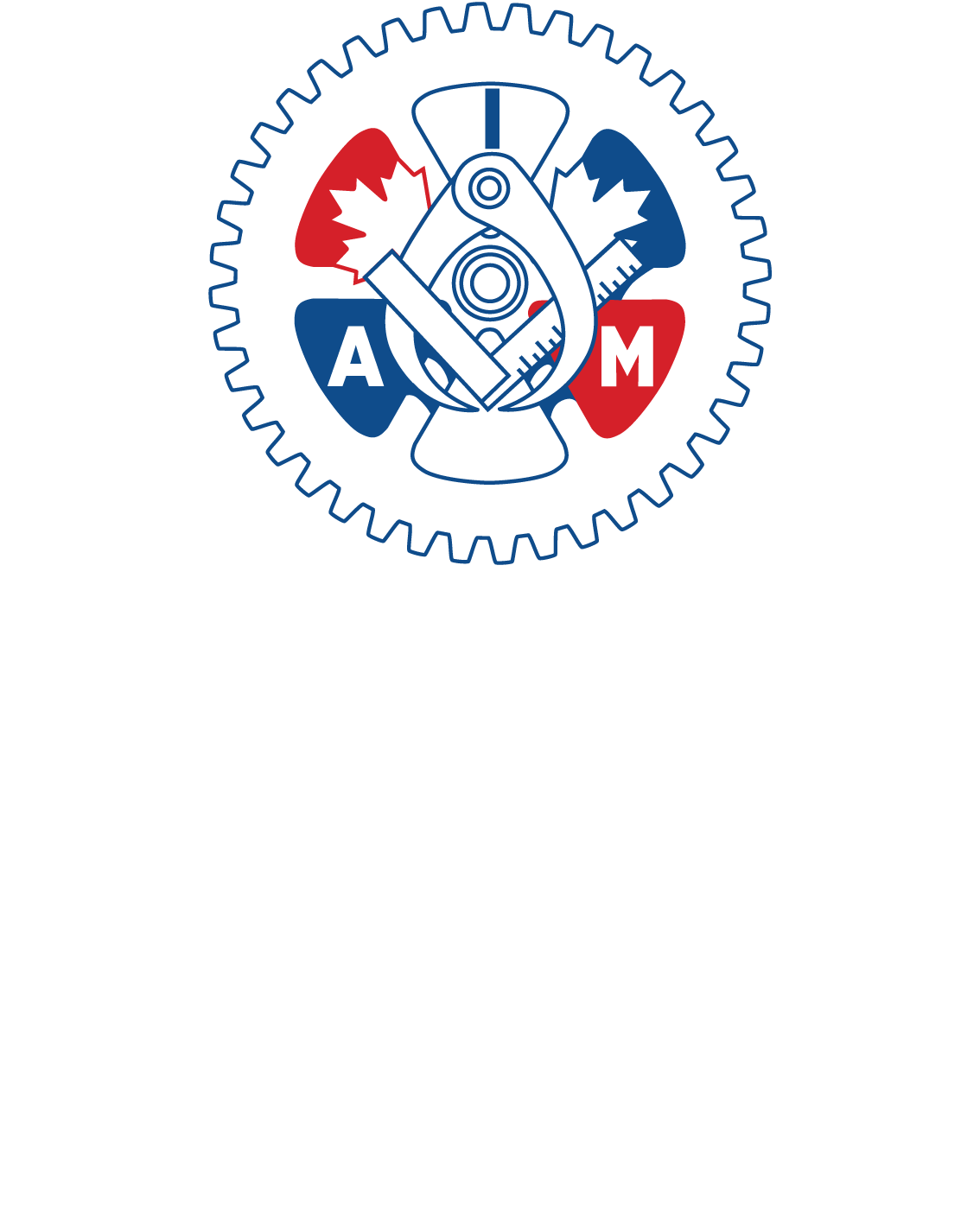
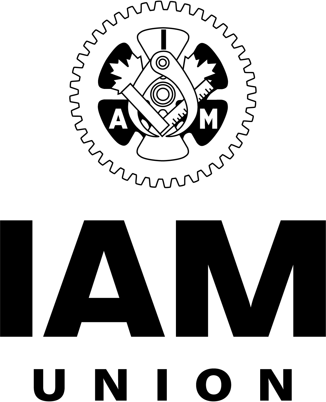
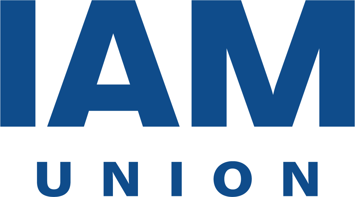
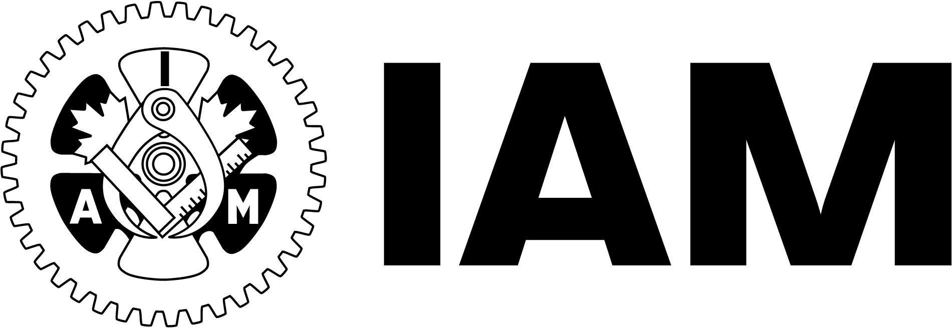
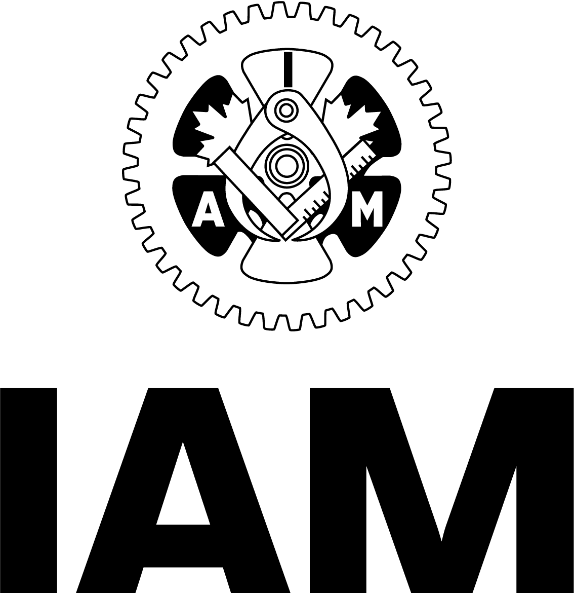
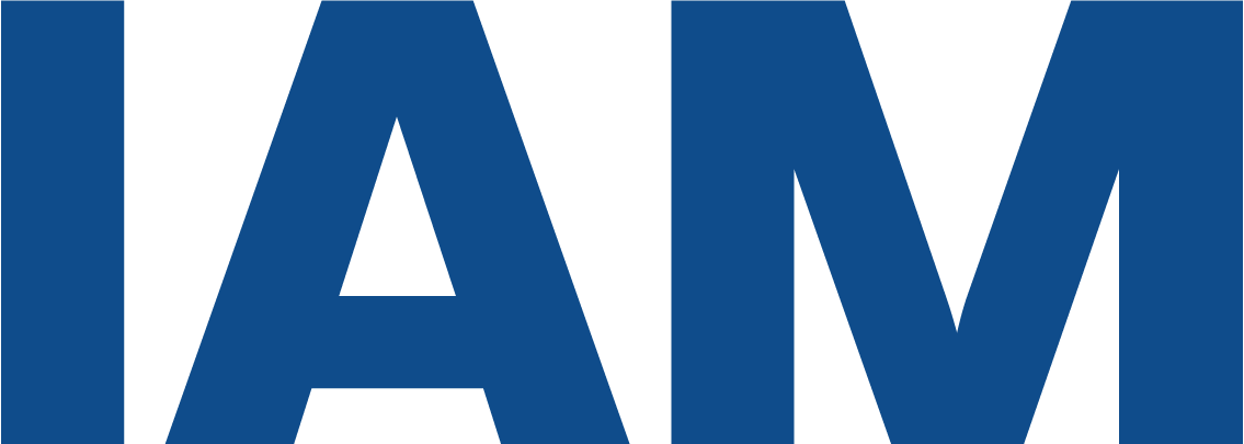
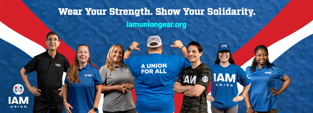
- IAM Union’s logo, sometimes referred to as a gear, is being adapted, as it has in the past, to welcome members of today and tomorrow, while also honoring the union’s proud history. The updated logo retains its original elements of a flywheel, a friction joint caliper and machinist’s square with the initials of the organization. The union is also adding a wordmark, in its historic primary color of royal blue, that simply and powerfully stakes its claim as “IAM Union” or “IAM.”
- Terminology has been updated within the organization. To further welcome members and for clarity, the highest level of the union is now known simply as the “International.” This change is also reflected in updated staff titles. The three primary levels of the organization will be known simply as “Local,” “District” and “International.”
IAM Union is gradually implementing its branding changes across the organization, and branding guidance is being disseminated to stakeholders.
IAM Union is one of North America’s largest and most diverse labor unions, representing approximately 600,000 active and retired members in the aerospace, defense, airlines, railroad, transit, healthcare, automotive, and other industries.
iamunion.com | @MachinistsUnion